So Nice
6.7.12
6.7.12
Some gorgeous minimalism from Interieur architect Frederic Kielemoes.
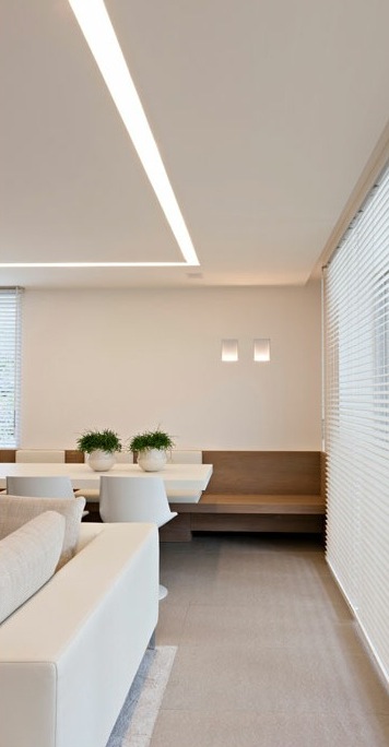
This lighting is way to amazing….just perfection.
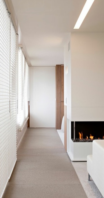
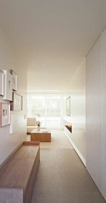
Love the frame arrangement in the hallway! Looks like some lovely light grey porcelain floors.
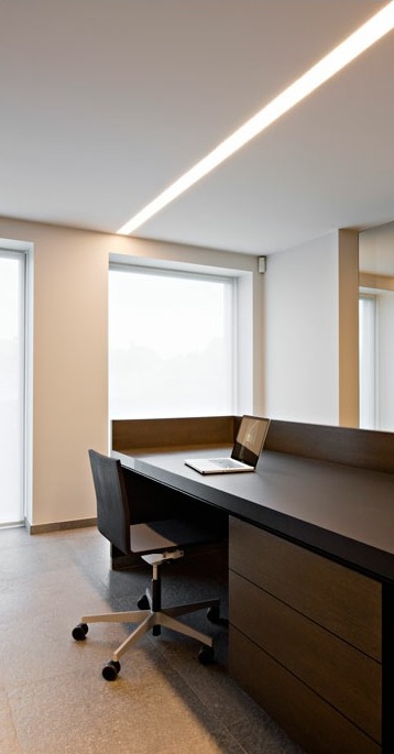
What a beautiful lighting detail…simple, long and linear shaft of light.
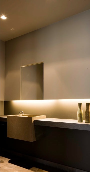
Oooh! What can we say here…beautiful detail with teh hood, the under lighting and the sink…so very seamless.
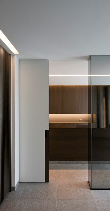
Pitter patter.
Some more for you tomorrow!
-
Jody Brettkelly
-
homestilo
-
homestilo
-
homestilo
-
Helen@thestyleschedule