|
|
|
|
|
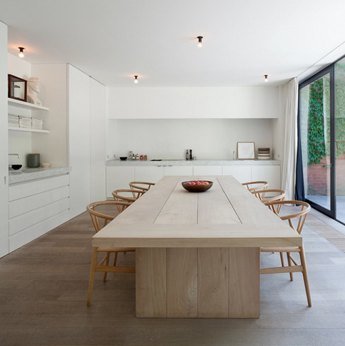
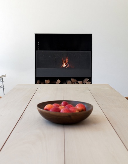
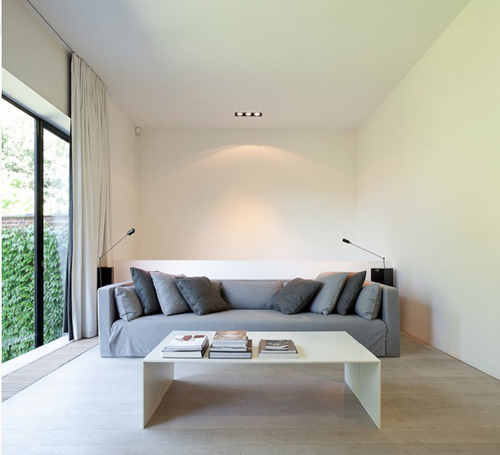
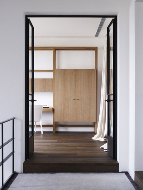
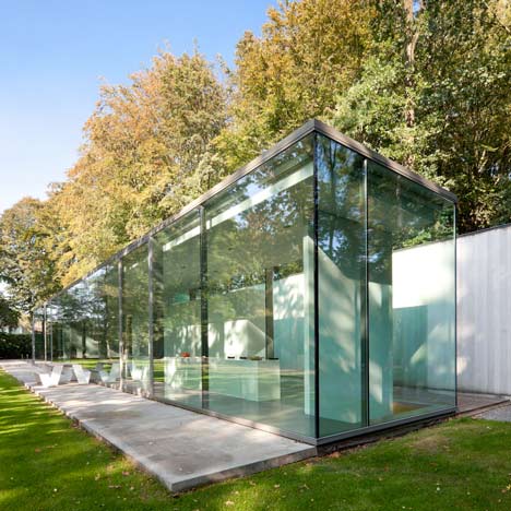
I’m really in love with this space. It feels very clean and open with expert detailing. I would imagine this home is in Belgium, you?

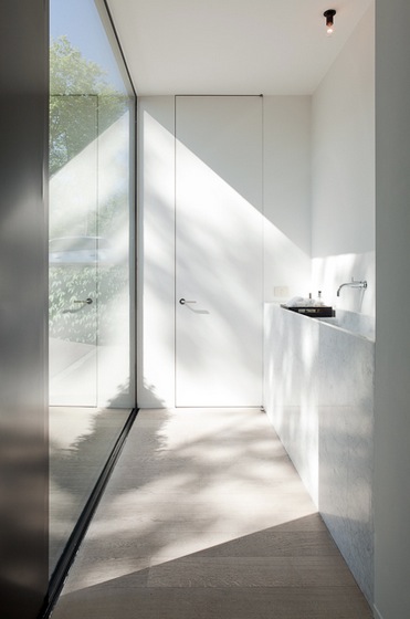
love how the door reaches all the way to the ceiling, not the mention how lovely the light drapes over the hallway.

i also like how the ceiling is not punctuated with recessed cans everywhere…there is this one simple recessed fixture. the drapes reach the ceiling, adding height to the space.

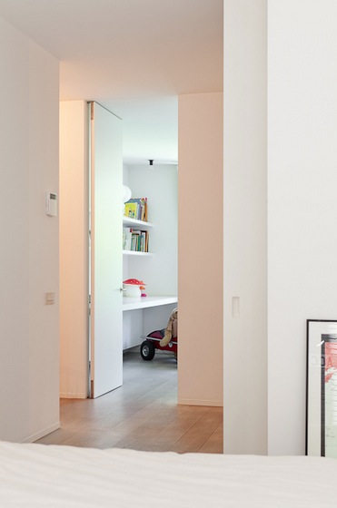
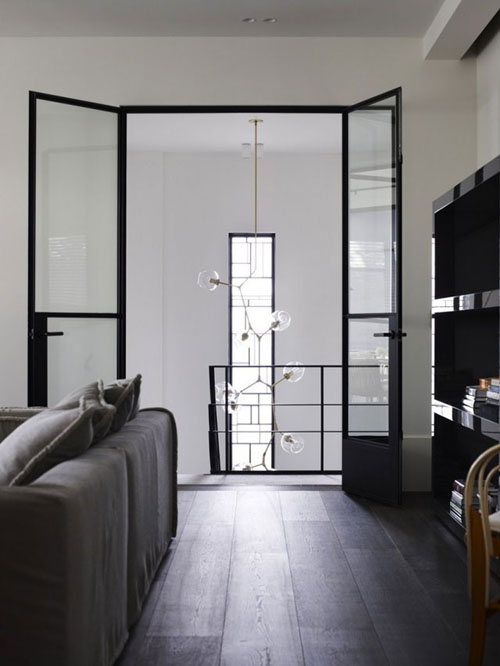
again, this door detail is so minimal.

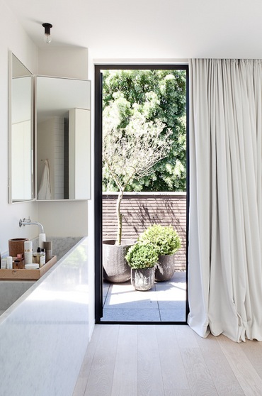
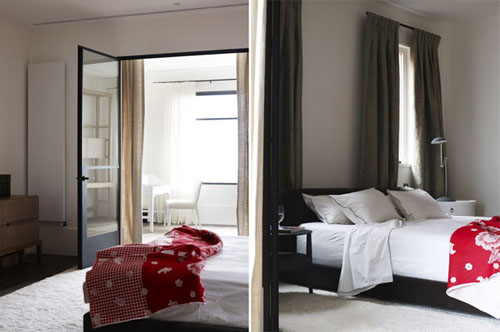
these drapes are so romantic in how they puddle to the floor, such a nice juxtaposition to the quiet feeling of the space.

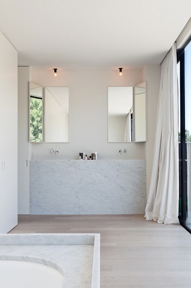
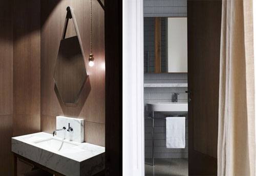
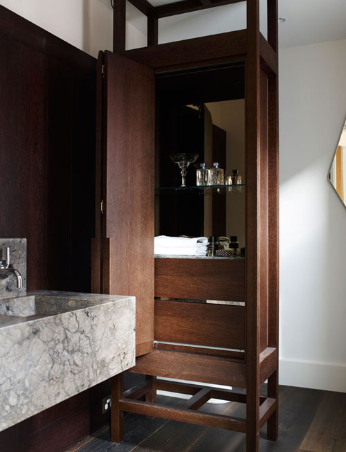
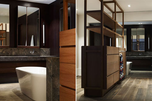
okay, this vanity is gorgeous…but where do you put the hairdryer??

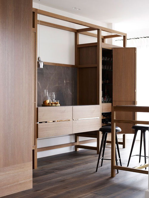
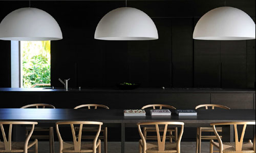
hans wegner chairs.


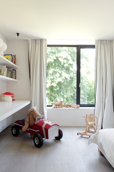
wood children’s toys are my favorite!
via
Posted in architecture, bathrooms, cabinetry, details, dining rooms, family rooms, furniture, hallway, kid's rooms, kitchens, shelving, windows |
No Comments
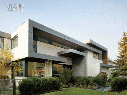
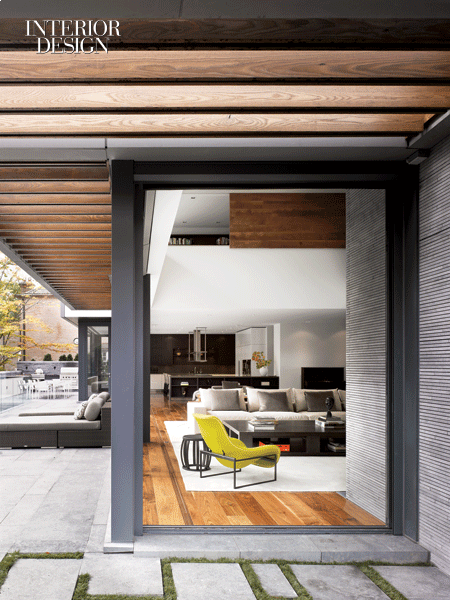
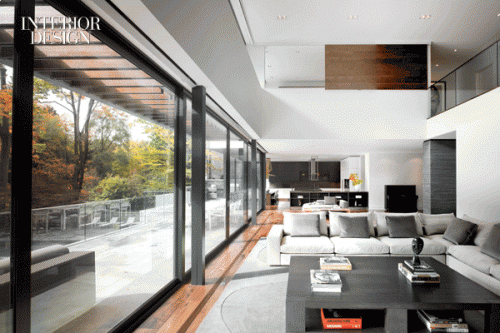
Another incredible collaboration from Belzberg Architects and MLK Studio in Toronto. Contemporary yet warm and welcoming.


B&B Italia Mart char in this fabulous bright color. Notice the interesting moss/stone pattern. Every single detail is accounted for here.

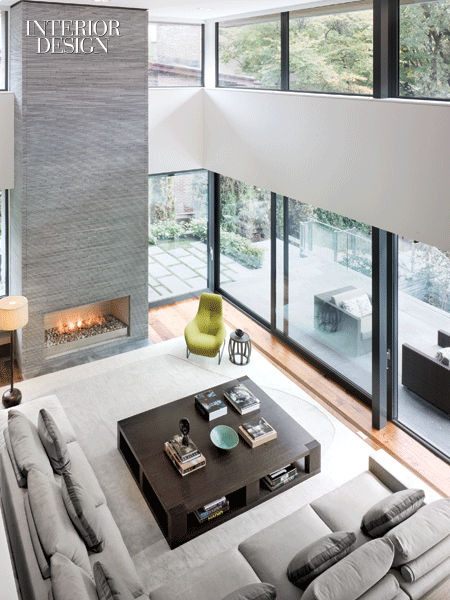
Christian Liaigre coffee table.

Flexform sofa looking so chic in grey and comfortable as ever.


Now let’g go up!

I think I’m in love with this Christopher Farr runner.

This looks like such a cozy hideaway!

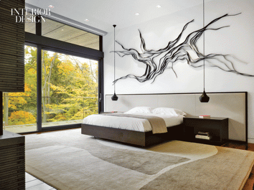
Wow, this is striking. I find this room a stroke of genius. Incredible upholstered bed and headboard. Love the Tom Dixon pendants dancing softly above the sturdy nightstands. Again, another beautiful Christopher Farr rug. A Dennis Lin sculpture creates movement above the bed.

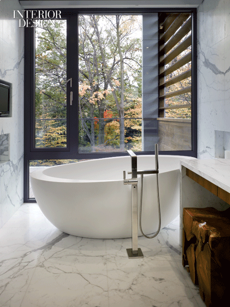
A room of calacatta marble with rich walnut wood and a soft sumptuous waterworks tub…Mmmmm.
Belzberg Architects | MLK Studio | Photos by Ben Rahn/A-Frame | via
Posted in architecture, bathrooms, bedrooms, cabinetry, details, entry, family rooms, fireplaces, furniture, hallway, libraries, living rooms, rugs, shelving, stairs, windows |
No Comments
This is a gorgeous project by Chamberlain Javens Architects. There are a lot of surprising details within every image and it is a pleasure to travel through each room and feel its effortless charm. Enjoy!


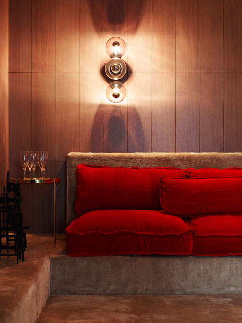
How cool is this lounge? Love the cushions in this sexy red and the unusual sconce above.

Surprising and comforting color palate.

This is absolutely gorgeous. The richness of the wood, juxtaposed with the crisp white walls. Loving the streamlined fireplace perched on the rich ledge below.

Mater stools.

Lindsey Adelman lighting.

The pillowy-ness of those drapes is so romantic…sigh! And I have to mention that gorgeous millwork. Love the combination of the darkish wood flooring with the caramel wood.

Yes, powder room, you are gorgeous!


Love! What incredible marble. And I am obsessed with this wood, walnut?


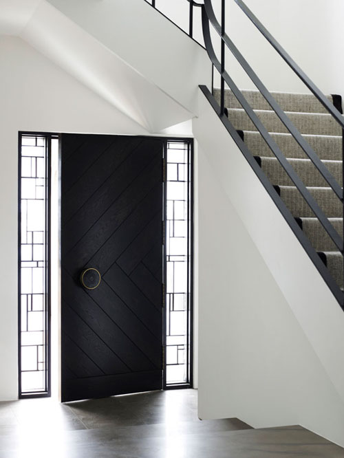
These doors!!
via + via
Posted in bathrooms, bedrooms, cabinetry, details, dining rooms, entry, family rooms, fireplaces, furniture, hallway, kitchens, lighting, living rooms, shelving, windows |
2 Comments
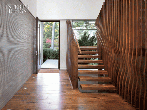
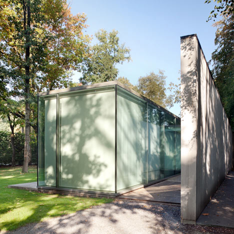
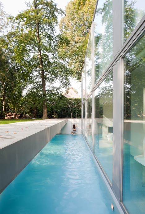
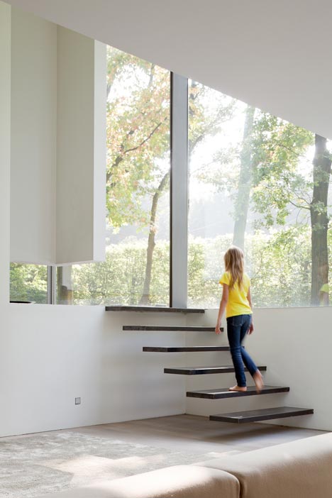
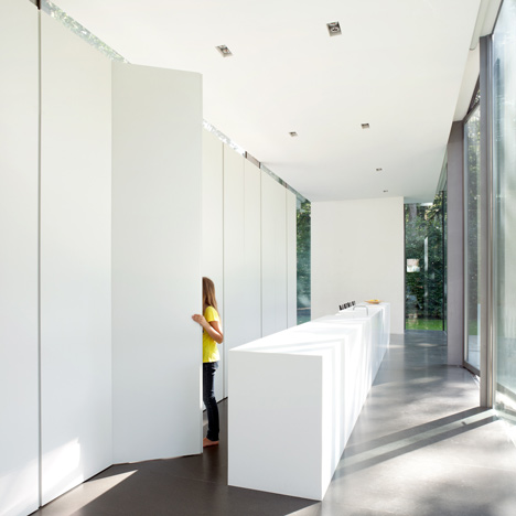
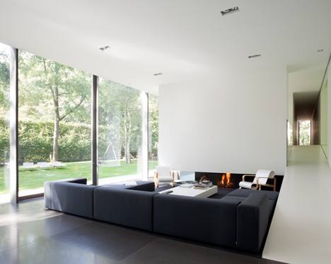
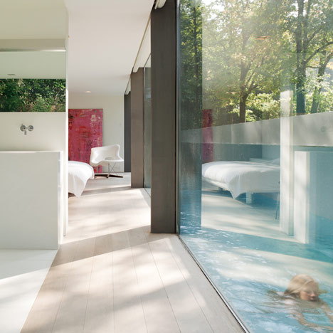
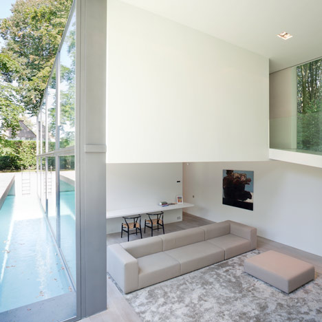
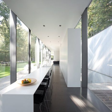
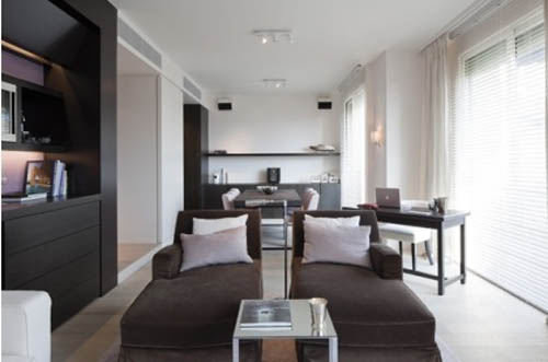
This is one of the most inspiring projects I have come across. Architecture by Govaert & Vanhoutte


If you need some privacy…bring down the solars!

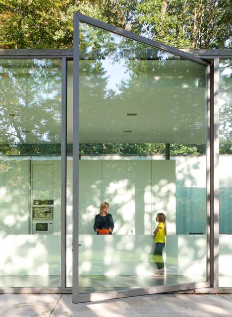
Quite a big door. Just gorgeous.

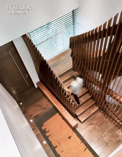
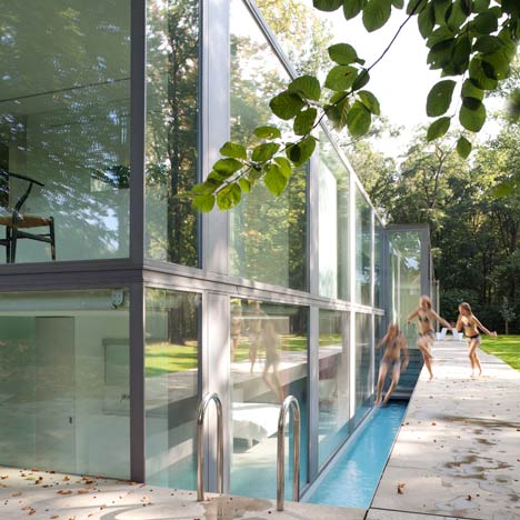
Rarely do you see actual people in architectural images…love this shot, full of movement and enthusiasm.


Floating stairs.

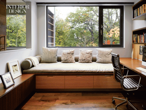
Some brilliant seamless storage.

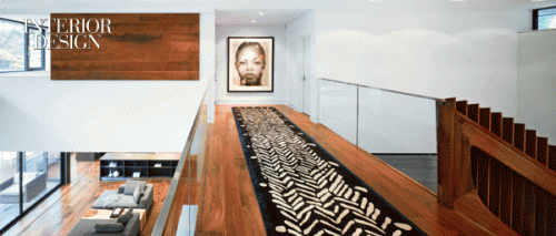
Have you noticed that these ceilings are impeccably clean…just the necessary rectangular recessed lighting not tons of cans peppering the view from below.


via
Posted in architecture, bathrooms, cabinetry, details, entry, family rooms, fireplaces, kitchens, living rooms, outdoor, shelving, stairs, windows |
19 Comments
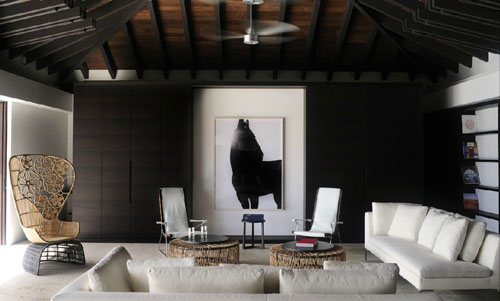
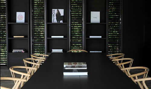
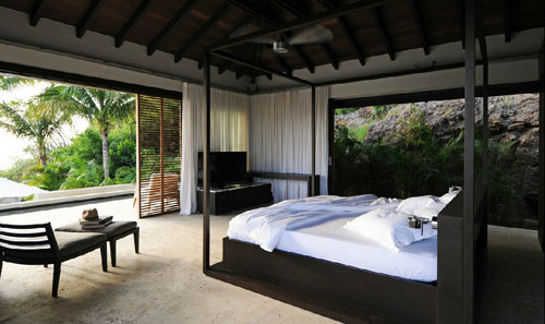
Can you tell St. Barths is on my mind?! Another incredible home by Wolfgang Ludes with rich sexy dark woods, natural textures, and sandy upholstery.

Charles sofas, Antonio Citterio chairs, a Patricia Urquiola woven chair and Atelier Oï tables.


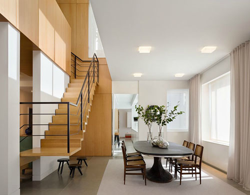
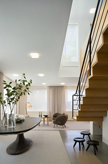
Just beautiful. This dining table is to die for! The top is one piece of slate. Stone, plaster and anigre wood, simple and effective. The small black stools are designed by Charlotte Perriand. Drapery fabric is Rogers & Goffigon.

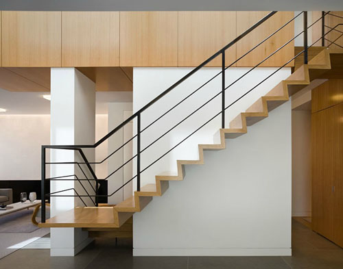
Anigre wood floating staircase.


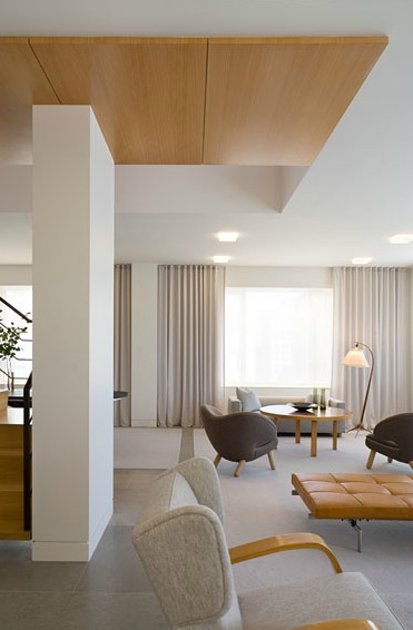
Restful color palate. Finn Juhl Pelican chairs, a Poul Kjaerholm daybed and Alvar Aalto table and wing chair. Look at that baseboard detail! The rugs feel like lily pads among the sea of light grey stone.

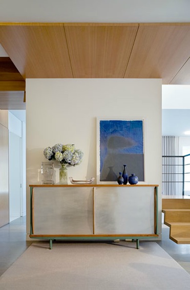
Andy Warhol’s Shadows series rests on a Jean Prouvé console.

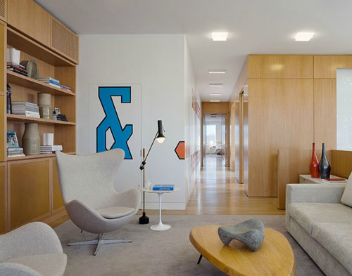
The illustrious egg chair by Arne Jacobsen.

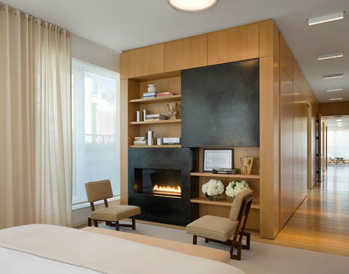
Blackened steel surrounds the fireplace.

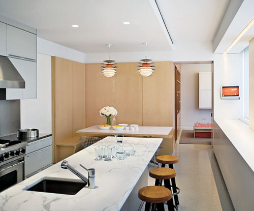
Pendant lamps by Poul Henningsen hang over the kitchen table. Viking range and hood.
Shelton, Mindel & Associates | Architectural Digest
Posted in architecture, art, bedrooms, cabinetry, color, details, entry, family rooms, furniture, interiors, kitchens, living rooms, shelving, stairs, windows |
6 Comments
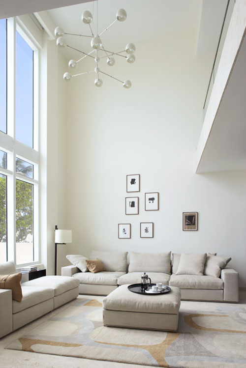
A light filled townhouse by Magdalena Keck in Miami beach.

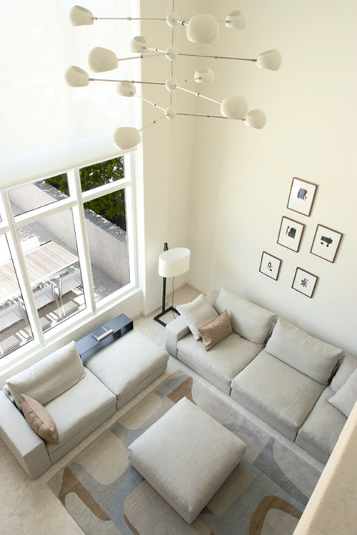
Flexform Groundpiece sofa and a gorgeous Christopher Farr area rug. I love the soft breezy color palate.

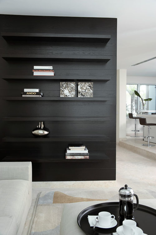
Floating shelf detail.

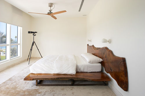
One of my favorite sconces – David Weeks Boi sconce, Boffi fan. This bed just makes this room.

David Weeks chandelier.

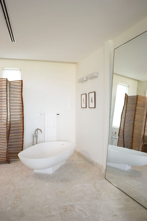
What a great oversized leaning mirror can do!
Beta Plus is my absolute favorite publisher. Their books are filled with stunningly european contemporary and warm interiors with the most interesting details. I have many of their books on my wish list!
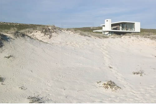
We can bundle up in a chunky sweater and walk down to the ocean here

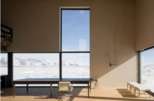
We can bask in the sun rays here. P.S. these windows are to die for!

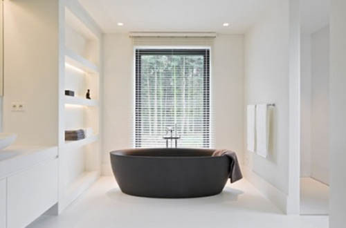
Then, take a nice soak here.

And finally curl up and watch a fab movie with hot chocolate and little bitty marshmallows here

Beta plus
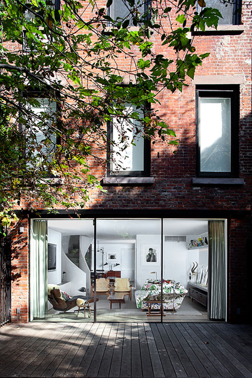
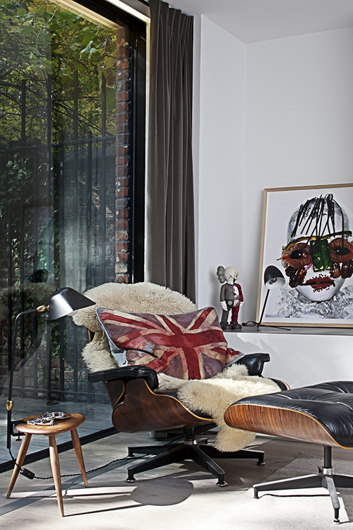
It’s hump day! Something special for you today from Workshop for Architecture.


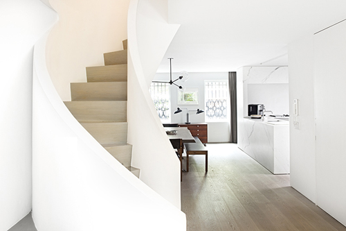
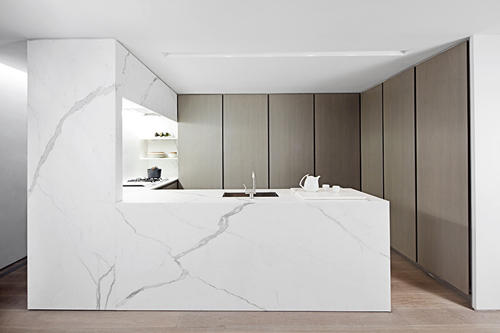
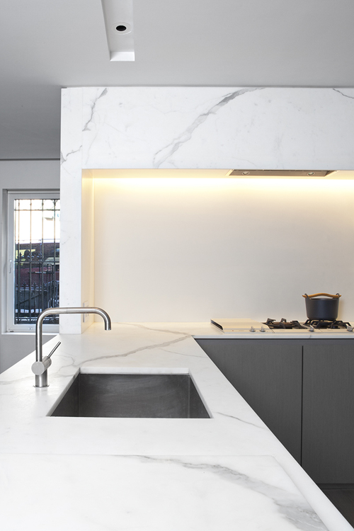
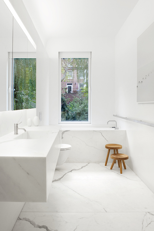
My perfect mix of materials, calacatta marble, light white oak, and a little bit of dark woods.

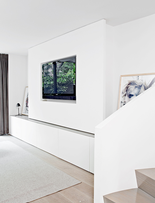
Great details here. TV inset and flush with the wall.

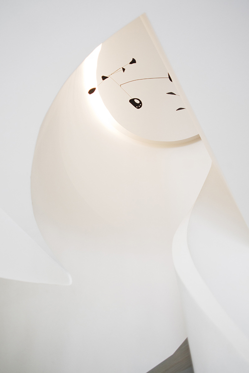
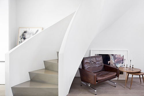
Looks like an Alexander Calder mobile.

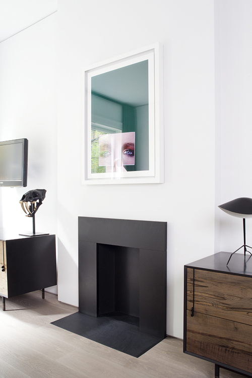
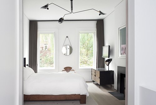
Oh oh oh! Just beautiful! Serge Mouille table lamps, Bddw cabinets.


Linear light with a hidden source.

Some more Serge Mouille. I also see the top of a walnut cherner armchair. Love the dark grey drapes with the mix of woods and black lighting.


via
I posted about Aidlin Darling Design a while back (here) and just recently revisited their work. Their interiors have a very subtle warm serene quality to them.

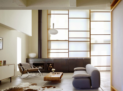
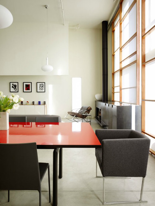
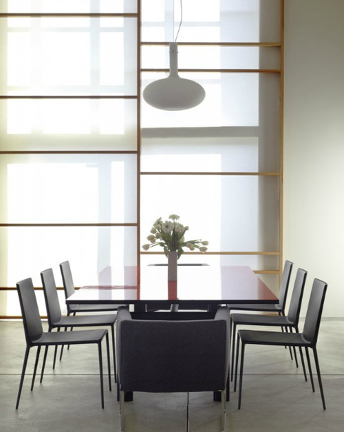
Modern day shoji screen? And very interesting forms in the furniture. I especially like the white they use on the walls, it is clean yet also inviting and warm.


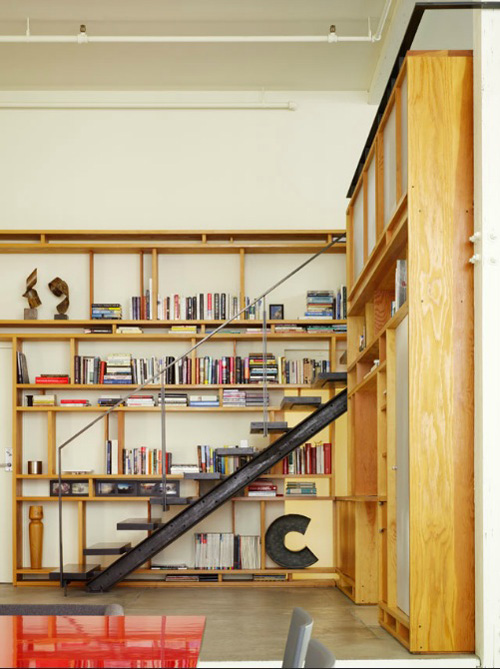
You can never go wrong with a giant wall of book shelves.


|
|
