|
|
|
|
|
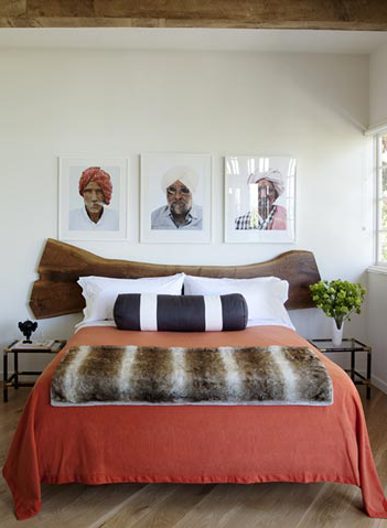
For Monday, a great example of perfect layering…without each item the room would feel less than. These natural wood headboards always get me.

via
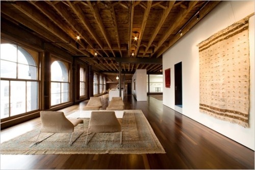
I’m really into this space and the tonality of it. These walnut floors are gorgeous and warm along with the wood ceiling and crisp white walls. The B&B Italia Patricia Urquiola chairs in this upholstery are stunning and the rug ties it all together.
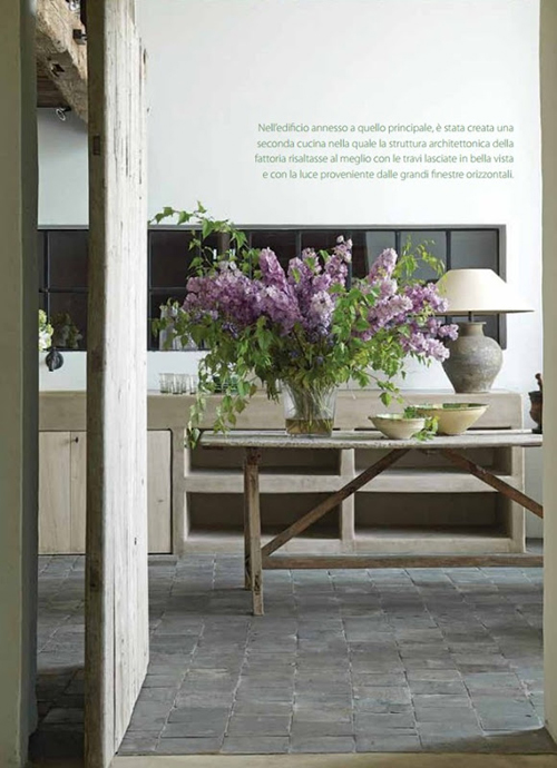
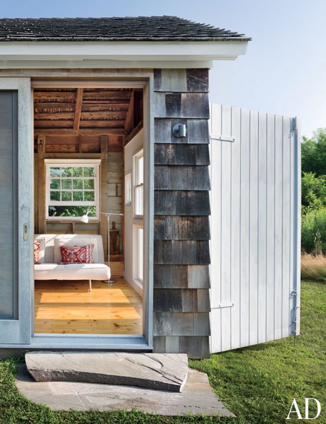
This feels very weekend-y…casual, calming and very Belgium. The old wood door/structure and stone flooring create the depth of the space. And this flower arrangement is way too gorgeous.
via
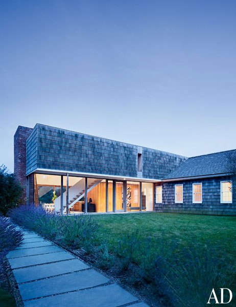
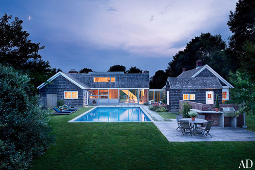
A gorgeous shingle clad home in the Hamptons by Christoff:Finio Architecture.
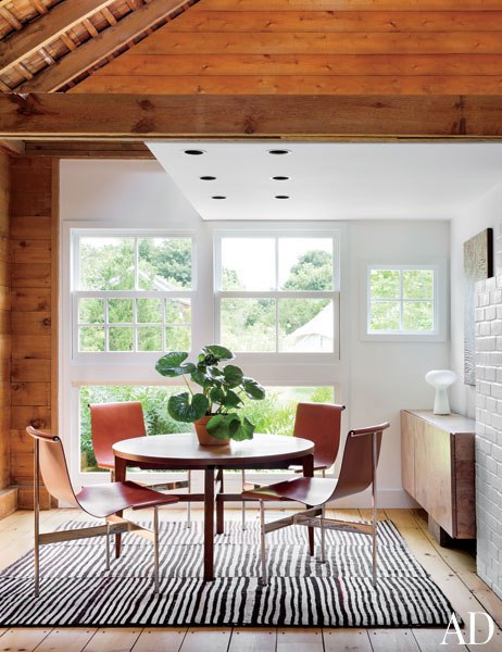
Here we have a mid-century Persian kilim and the TG-10 dining chairs designed by Bill Katavolos. I really like the mix of these two.
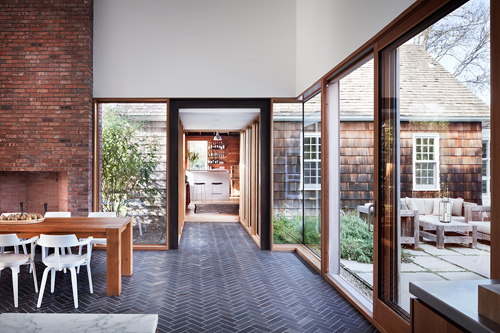
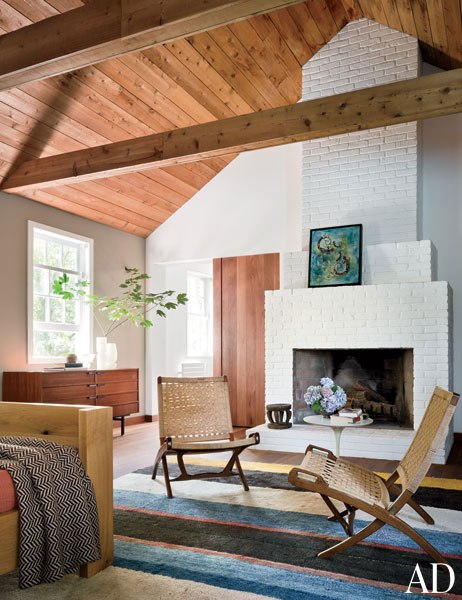
Hans J. Wegner chairs from Laurin Copen Antiques.
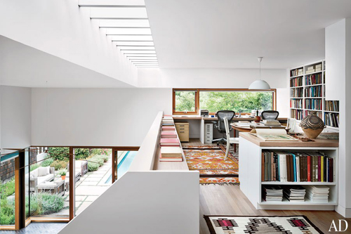
A great perch of an office with an Arne Jacobsen pendant light from Louis Poulsen Lighting and a golden Moroccan kilim.
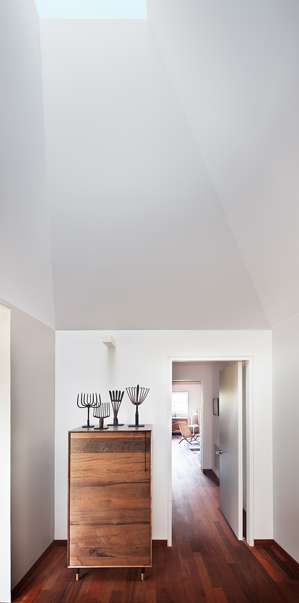
A BDDW cabinet.
via
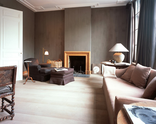
This space is really inspiring me from the romantic dark billowy drapes, to the wood walls, the white oak floors, to the mouldings on the ceiling.
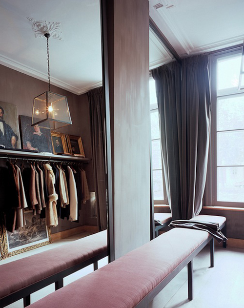
This closet is so fabulous. I think this looong bench makes it!
via
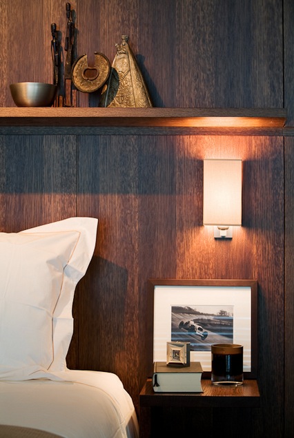
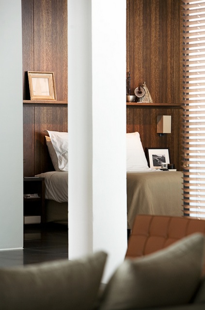
A few details to start off the week. I will always be a sap for a warm wood wall. Especially in a bedroom.
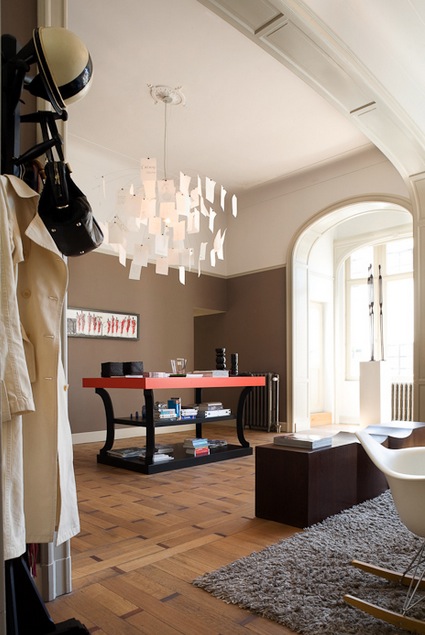
Christian Liaigre console and Ingo Maurer light fixture. Lovely mouldings around the arch.
via
I normally gravitate towards white; white walls, white ceilings, white furniture (sometimes a bad idea). But this blue kitchen seems really lovely to me. It is a calming sophisticated blue, with hints of grey and green. Very chic. I don’t know how long I could live with a blue kitchen before wanting to paint it white but for now, it’s good.
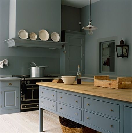
via
Prince George is here! Congrats to Kate and William. It has been so exciting being in London for the birth. I know Kensington Palace is still under construction but I wonder what Prince George’s nursery will look like? It brings to mind my favorite little boys room by Kelly Wearstler.
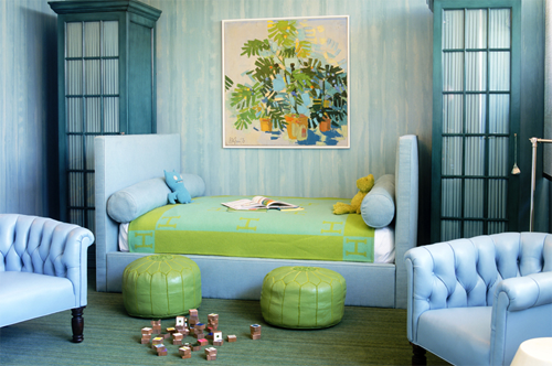
The mix of blues and greens are masculine but also soft and calming.
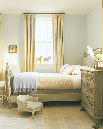
Or maybe his room will look like this…traditional but clean. Just darling, darling!
via and via
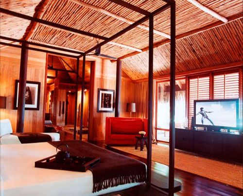
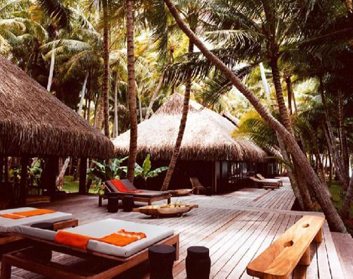
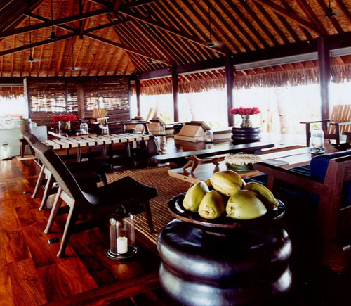
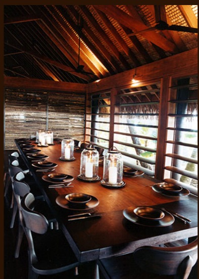
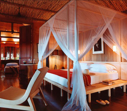
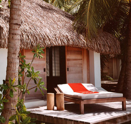
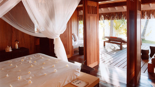
Motu Tane is a private island in French Polynesia. It is still so hot here in London, that I am going to imagine being on this tropical island enjoying the heat instead of in central London not enjoying the sticky icky heat. I’m not complaining or anything. The best part is that it is designed by Christian Liaigre. You can rent the private island for $40,000 a night. Enjoy!
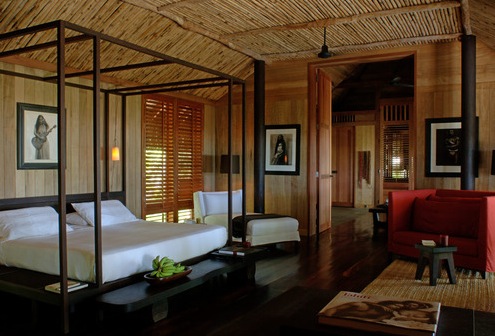
Functional use of dark woods to minimize the bright sun. The red chair gives a POP and some energy to the room. The natural abaca rugs add texture. Perfectly complimentary palate of materials.
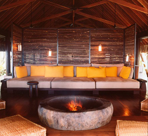
This might be my favorite spot. I love the brightly colored pillows with the dancing fire in front. I am OBSESSED with Christian Liaigre furniture. This stool is crafted and conceived to fit right into the environment. I would like one for myself!
motu tane island
Posted in architecture, bedding, bedrooms, details, dining rooms, family rooms, fireplaces, furniture, interiors, living rooms, windows |
1 Comment
I’m really in love with this space. It feels very clean and open with expert detailing. I would imagine this home is in Belgium, you?
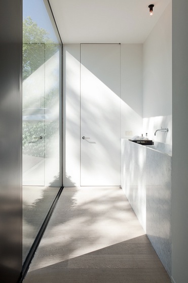
love how the door reaches all the way to the ceiling, not the mention how lovely the light drapes over the hallway.
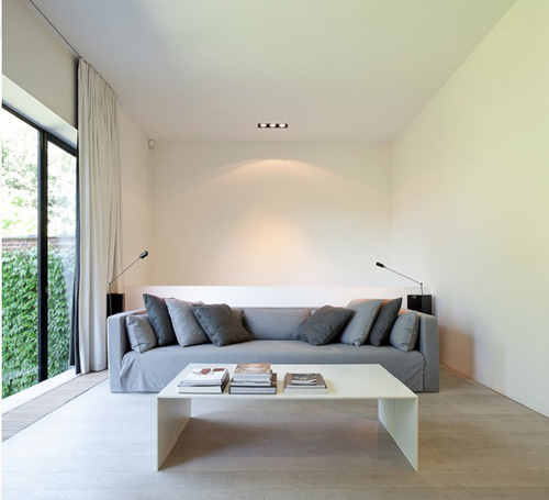
i also like how the ceiling is not punctuated with recessed cans everywhere…there is this one simple recessed fixture. the drapes reach the ceiling, adding height to the space.
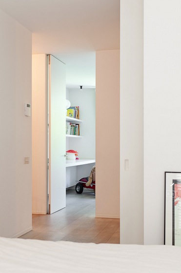
again, this door detail is so minimal.
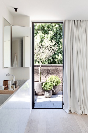
these drapes are so romantic in how they puddle to the floor, such a nice juxtaposition to the quiet feeling of the space.
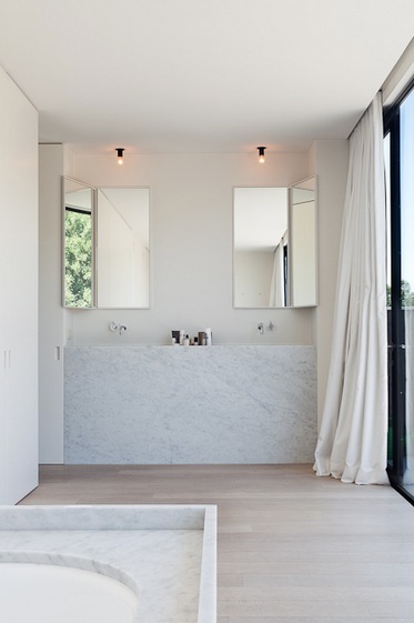
okay, this vanity is gorgeous…but where do you put the hairdryer??
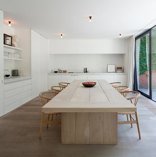
hans wegner chairs.
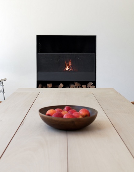
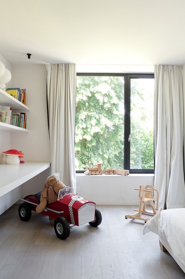
wood children’s toys are my favorite!
via

Posted in architecture, bathrooms, cabinetry, details, dining rooms, family rooms, furniture, hallway, kid's rooms, kitchens, shelving, windows |
No Comments
|
|
